Emaho: In 2011, you’ve said, press work was collapsing, with commissions disappearing and salaries cut drastically. You’d collected photobooks by the thousand since your first paycheck at 20, and you’d worked at AFP, REA and in documentaries. What was the moment you knew you had to leave photojournalism, and what did you grieve?
Pierre Bessard: I don’t think there was one precise moment when I decided to leave photojournalism. It was more of a gradual realisation. By 2011, the media landscape had changed profoundly. Assignments were becoming scarce, budgets were shrinking and working conditions were deteriorating. It was becoming increasingly difficult to see a future in the profession.
But I think this change also gave me the opportunity to return to something that had been part of my life for a long time: photobooks. I had been collecting them since I was twenty, when I received my first paycheck. Over the years, this collection had become a real passion, almost a second life. Ultimately, I didn’t so much abandon photography as change the way I approached it. With Éditions Bessard, I found another space of freedom: working with photographers, supporting them, creating books and giving their images a physical and lasting existence.
What I probably missed was a certain spontaneity of photojournalism: being out in the field, meeting people, discovering unexpected situations. That human and unpredictable dimension is something I sometimes miss. But I never considered it a renunciation. I simply shifted my perspective. I moved from producing images to creating objects that tell their stories. And, essentially, I am still working in the same world: photography and the people who make it.
Emaho: Your own book Behind China’s Growth, with Polaroid portraits of Chinese workers, was your first real lesson in book-making. You lived two years in China and got involved in the typography, the HD scans, the Japanese paper and the binding. What did making a book in China teach you that you couldn’t have learned in Paris, and what went wrong?
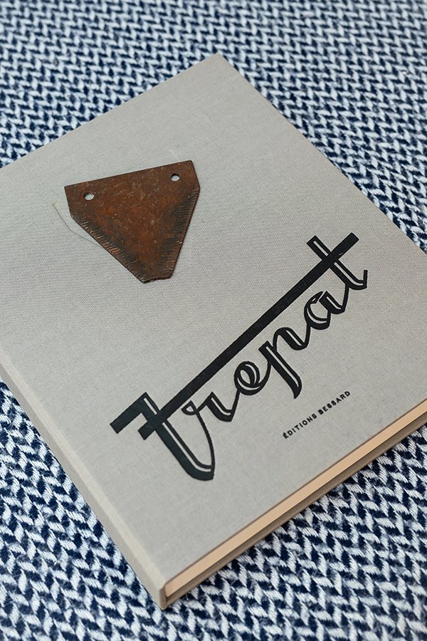
Pierre Bessard: Behind China’s Growth was not my first book. I had already produced an earlier publication printed using phototype printing, on Arches paper, with letterpress typography composed by Jean Hofer. It was a very important first experience for me, an introduction to the nobility of traditional printing techniques and to the exacting standards of book production. Behind China’s Growth was another step, on a completely different scale. I had lived in China for two years and worked on a series of Polaroid portraits of Chinese workers. The project was sponsored by the president of Alstom, with a budget that gave me almost complete freedom. I could approach the book as a genuine object without having to compromise my intentions because of financial constraints. I chose 300-gram sheets, Japanese paper and spot varnish, and paid particular attention to the typography, high-definition scans and binding.
Above all, this freedom allowed me to understand that making a book involves much more than simply laying out photographs. I construct my books in the same way a film is edited. Eisenstein’s theory of montage is an essential reference for me: meaning does not emerge solely from each image taken individually, but from the way images confront one another, follow one another, and create tensions and pauses between them. One image calls for another, sometimes contradicting it, sometimes giving it a new meaning. The book then becomes a form of storytelling, with its own rhythm and dramaturgy.
Living in China taught me to consider production as a whole. You no longer think only about the image you look at, but also about the image you hold in your hands: its weight, its texture, the way light catches the paper. The book is no longer simply a container; it becomes an extension of the photographic work. Not everything necessarily went as I had imagined. Even with considerable financial freedom, you have to accept that materials impose their own rules. Papers react, colours change, techniques have their limitations. You have to learn to work with these constraints rather than trying to eliminate them. Looking back, I believe this experience gave me a conviction that has never left me: a photobook must be conceived as a work of art in its own right. It is not simply about reproducing images, but about inventing a form, a space and a temporality for them.
Emaho: Your first book, Max Pam’s Ramadan in Yemen, grew from a Paris gallery vanishing with the print you’d half paid for. It’s a 1993 travel diary of square black and white photos, stamps and handwriting, in a clamshell box of 1,000 numbered, signed copies. It later landed in Parr and Badger’s Photobook history and set off what you called a tsunami of orders. What was it like to see your first book sell out around the world?
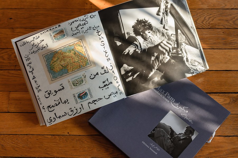
Pierre Bessard: I remember this story very clearly because it almost feels like the beginning of a novel. At the time, I had entrusted a photographic print to a Paris gallery and paid a deposit. The gallery disappeared, taking both the print and the money with it. I was left with practically nothing, apart from the desire to do something with this missed encounter. That is how the idea of publishing a book with Max Pam came about. Max Pam is an Australian photographer, a great traveller, an artist whose work has developed over decades of exploring the world. He works notably with a medium-format Hasselblad. His approach is very free, instinctive, almost literary. He does not simply photograph a place: he collects its traces, faces, writing and fragments of life. Ramadan in Yemen is the diary of a journey made in 1993, during the month of Ramadan. Max travelled throughout the country, photographing its inhabitants, streets and landscapes while keeping a handwritten journal. The book brings all this material together in a form that is as much a travel diary as a photographic album. I absolutely wanted to preserve this intimate, organic dimension. So we designed a square book containing black-and-white photographs, handwritten notes, stamps, marks and fragments of the original journal. Everything was presented in a rigid clamshell box, whose cover reproduced the sandy colour of the Yemeni desert.
The book was produced in an edition of one thousand numbered and signed copies. I also wanted to work with Titus Nemeth on the typography. He is a typographer and historian whose work is deeply connected to the culture of Arabic writing. He had spent time in Damascus studying the language and specialised in the relationship between Arabic and Latin scripts. For Ramadan in Yemen, we worked on an original typeface that subtly evokes Arabic calligraphy without becoming illustrative or falling into pastiche. I wanted the typography to be a genuine creation, not simply a choice of font. This is, in fact, a rule I have always followed at Éditions Bessard: I systematically credit type designers in the legal notices of my books. Their work deserves to be recognised just as much as that of the photographer or graphic designer. Then something happened that I had absolutely not anticipated. Martin Parr first selected Ramadan in Yemen as one of the ten best photobooks of the year. For a first book, that was already considerable. But Martin Parr is not simply a photographer: he is also one of the world’s greatest collectors and historians of the photobook.
His judgement carries exceptional international influence. He subsequently included the book in the third volume of The Photobook: A History, which he produced with Gerry Badger. It was a tremendous catalyst. Orders started arriving from everywhere. Specialist booksellers, collectors and institutions began taking an interest in our work. I discovered, almost overnight, that a small independent publishing house in Paris could reach an international audience. The first book had found its way into the world. Martin Parr continued to recognise our work over the years, taking an interest in several other publications from the house. This was notably the case with Wuhan Boiler Company Workers, which appears in his book The Chinese Photobook: From the 1900s to the Present. This gradually helped establish Éditions Bessard within the broader history of photography and photobook publishing. There is another anecdote that is particularly close to my heart. Ramadan in Yemen was the publishing house’s first book, but the second title we published, Chattanooga: The Green Factory, also received recognition in the world of typography. It was selected among the best projects by the Tokyo Type Directors Club, in an international competition that received 3,289 submissions. This was another form of recognition, this time for the editorial and typographic work. I believe these early experiences established something fundamental in the way I work. I never wanted to create a publishing house that simply made books to display photographs. I wanted to build singular objects in which the photographer, typographer, paper, binding, graphic design and editing all contribute to a single form of writing. Seeing your first book receive such an international response is obviously an immense satisfaction. But the most important thing was not having sold a thousand copies. It was realising that an ambition which might initially have seemed unreasonable had found its place. That first success gave me the energy and confidence to continue taking risks, discovering artists and producing books that would not resemble those that came before. Ultimately, Ramadan in Yemen was not just the first book published by Éditions Bessard. It was a kind of silent manifesto: proof that an independent book, conceived with high standards and conviction, could travel much further than its publisher had ever imagined.
Emaho: Wang Qingsong’s History of Monuments turns a single 42-metre photograph into a double-sided accordion that’s over 8 metres long, in a handmade box, edition of 450. You commissioned a typeface from Peter Bilák, and a sculptor carved bronze plates for 50 covers. How do you even begin making an 8-metre book, and what almost went wrong?
Pierre Bessard: With Wang Qingsong’s History of Monuments, everything began with a meeting and an intuition. I was determined to work with Wang Qingsong. I had discovered his work in a book devoted to contemporary Chinese artists that Professor Michel Soutif, the maternal grandfather of my two children, had given me for my birthday. His name appeared in it, and I immediately wanted to meet him. Michel Soutif was quite an extraordinary person: a physicist, former president of the French Physical Society, and the first president of the University of Science and Medicine in Grenoble, but also someone passionate about China, whose language he spoke and whose culture he knew in depth. He had played a major role in developing academic and scientific relations between Grenoble and Shanghai. In particular, he had known Jiang Zemin when he was mayor of Shanghai, before he became President of the People’s Republic of China in 1993. This family connection had given me a particular closeness to China and a desire to discover its contemporary art scene. So I went to visit Wang Qingsong in his studio in Beijing. I still remember that first discovery. There was an enormous photographic mural on the walls, as well as walls covered in plaster, on which the figures had been placed, as if the artist had constructed a theatre on a world scale. It was a monumental installation, almost like a film set. I immediately thought that it should become an accordion book. But there was a problem: I hate accordion books whose reverse side is simply blank, a succession of empty pages that tells you nothing. I wanted the book to be readable from both sides, with its unfolding as rich as the image itself.
And that’s when I discovered something that was going to completely change the project. Pinned to one of the studio walls was Wang Qingsong’s working plan: an enormous preparatory document, with appointments, instructions and annotations written in Chinese in red marker. It was, in a way, the backstage of his work, its script, the record of how it had been constructed. I asked him whether we could also publish this document, allowing readers to discover the genesis of the enormous mural on the reverse side. He agreed immediately. I was delighted: we had found our book. The original image measures 42 metres. Wang Qingsong had brought together more than two hundred models over fifteen days to create this monumental photograph. As for the book, we had to find a way to transform the work into an object that could be handled and unfolded over 8.40 metres, while still remaining a book that people could hold in their hands, leaf through and read. We worked on achieving a genuine narrative balance. At the centre of the composition is Buddha. To his left is Mao Zedong, with his arm raised, and to his right the Statue of Liberty, also with her arm raised. Three figures, three representations of power, history and civilisations. This arrangement made a particular impression on me. It gave the composition an almost philosophical dimension. It was actually while looking at the sculptures in the studio that another idea came to us: why not extend this sculptural dimension into the book itself? We decided to have bronze plates made for fifty copies. I entrusted this work to Martín Salazar, a French-Peruvian sculptor who had studied and worked in China for several years, particularly in Beijing and Shanghai. He knew sculpture and bronze-finishing techniques perfectly well, especially patination, which he had taught in Shanghai. Thanks to the relationships I had established in China, we were able to use a foundry without having to pay for the use of its facilities; we only had to pay the foundry workers. Even so, the production costs remained considerable. A childhood friend, Claire, who was living in Geneva, agreed to finance the advance needed to launch the project. Without her trust and generosity, the book would undoubtedly have been much more difficult to produce. I also commissioned a typeface from Peter Bilak, whose work was to accompany the visual identity of the entire project. I wanted every element, right down to the typography, to contribute to the construction of the book.
But, strangely enough, the moment when we almost jeopardised the project was not what you might imagine. It was a much simpler mistake, and entirely my responsibility: the choice of paper. I had selected a beautiful paper, with a rather cotton-like texture, which seemed perfectly suited to the object. We had prepared everything: the files, the settings, the colours. We started the first print run. But as soon as the sheets came out of the machine, I immediately realised that something was wrong. The paper was absorbing too much ink and causing the image to lose definition. For a photograph of this kind, where every detail matters, that was unacceptable. I immediately asked them to stop printing. We had to start all over again, change the paper and begin again. The printer was remarkably understanding. We chose a new stock, readjusted the settings and restarted production. This time, the result was perfect. Perhaps this is one of the most important lessons I have learned from the experience: you can have a very precise idea, a budget, a team and an entirely prepared production process, but a book remains a living object. Paper, ink, folding and binding each have their own character. You have to know when to recognise that everything needs to stop rather than accept a mediocre result. Today, when I think back to History of Monuments, I don’t see only an 8.40-metre book, an edition of 450 copies or fifty bronze covers. Above all, I see that studio in Beijing, the enormous mural, the model pinned to the wall and those red annotations in Chinese. That is where the book was truly born. I believe that my work as a publisher consists precisely of this: looking at a work, trying to understand what it contains beyond what is immediately visible, and then imagining a form that allows it to exist in another way. Sometimes that form is eight metres and forty centimetres long. And sometimes it also requires a little bronze.
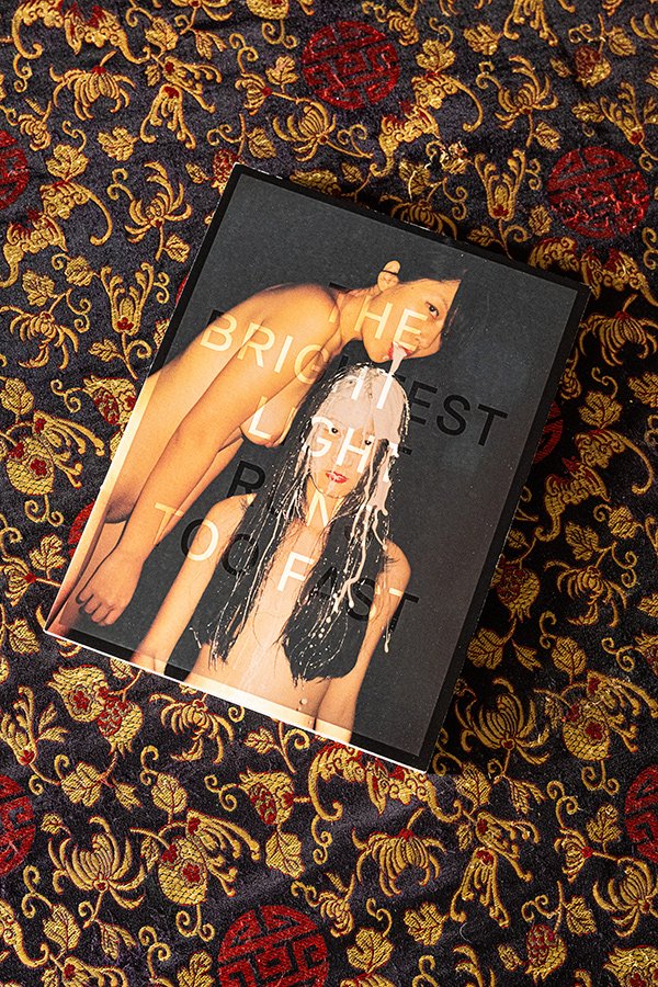
Emaho: Ren Hang’s The Brightest Light Runs Too Fast (2014) has a cover that only reveals its image above 27 degrees, or at the touch of a hand, with design by Ramon Pez and an edition of 500 with a signed print. It sold for 75 euros and now trades for thousands. What did you tell Ren Hang when you proposed a cover you can’t see, and how does it feel to see it become a collector’s object?
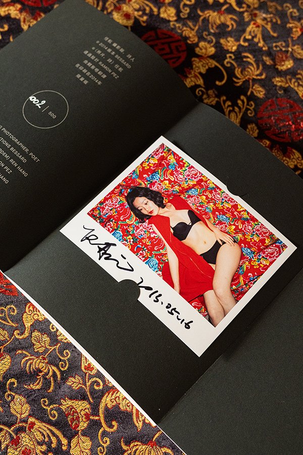
Pierre Bessard: Ren Hang was a friend. Whenever I went to Beijing, I would almost always see him. We shared many evenings, parties and moments of friendship. When he came to Paris, he would visit me at home. We would drink Chinese tea according to the traditional ritual, and he would bring books he had self-published and little gifts from China. I remember him as a young man who was both extremely free in his work and rather melancholic in his personal life. The story of The Brightest Light Runs Too Fast began in 2012, two years before its publication. Originally, I had absolutely no intention of making it into a book. I had included Ren Hang in my Zine Collection, a small collection I had created around books printed on Fedrigoni paper, in limited editions of 250 copies. Each issue came with small photographic prints signed by the artist. The layout had already been completed, and I had even had all 250 photographs signed by Ren Hang. This explains why there are two different colours of signature: the first were signed at his apartment when we met; the second batch was signed the following year, when I decided to turn the project into a book. It is important to point out that the Zine Collection is also a collection of books, with its own format and editorial approach. It is not a matter of opposing a book to a fanzine, but of two distinct editorial approaches. This collection was part of a very specific publishing strategy. I wanted to maintain a constant presence in the photobook market, publishing at least one title a month and creating a regular appointment with collectors. Sales of the publishing house’s first books allowed me to develop this momentum. In the meantime, however, I could sense that something was happening in contemporary Chinese photography. A new generation was emerging, with a much freer relationship to the body, sexuality, identity and self-representation. Ren Hang embodied this generation beautifully.
His work was profoundly distinctive. He photographed his friends, mainly young men and women, often naked, in compositions that appeared improvised but were in fact highly constructed. Bodies intertwined and overlapped, becoming almost like sculptures. He might place a body in a tree, assemble legs and arms into geometric shapes, or introduce a flower, an animal or some unexpected element. There was a sense of poetry, humour, eroticism and sometimes absurdity in his images. The colours were bold, the compositions direct, almost insolent. He was not trying to tell a political story, but his work inevitably collided with the taboos and censorship of Chinese society. I therefore decided to transform what was supposed to be a small publication into a proper book, with an edition of 500 copies, accompanied by an original signed photographic print. This is where Ramon Pez came in. To me, he is a true genius of art direction. I had told him about an anecdote that had made a strong impression on me. During one of his visits to Paris, Ren Hang had arrived at my home with two books he had self-published and a few Chinese gifts. He was particularly upset: Chinese customs had confiscated his books and gifts, partly because of their content and covers. This story had struck me. It was possible, then, to go so far as to prevent an artist from travelling with his own books. Ramon immediately made the connection with censorship. He imagined a cover that could get around this difficulty, with an idea that was as simple as it was brilliant: make the image invisible when you look at the book normally, and allow it to appear only above a certain temperature, beyond 27 degrees, or when touched by a hand. The cover used thermosensitive technology. When cold, it remained black. The photograph gradually appeared under the effect of heat. It was a rather mischievous way of responding to censorship: the image was there, but it did not reveal itself immediately. It required a gesture, a physical presence, almost a complicity between the reader and the book. At first, we considered using a photograph depicting male genitalia. But we noticed an amusing paradox: since the image was supposed to appear through contact with the hand, the gesture required to reveal the photograph could itself take on a sexual connotation, almost suggesting a form of masturbation. We eventually decided not to put the reader in that slightly embarrassing position. I chose a photograph of a female nude, an image celebrating the beauty of bodies, in which the body becomes a sculptural form. The idea was not to tone down Ren Hang’s work, but to find the right image for this particular experience.
I thought the idea was wonderful because the cover became a kind of performance. The reader was no longer simply discovering a photograph: they had to intervene physically to make it appear. The book had something secret about it, almost clandestine. At the time, Ramon and I had even imagined an entire collection devoted to censorship, featuring artists from different countries. I was in contact with several Iranian women artists I had met on social media. We wanted to explore the different ways in which artists could work around prohibitions, political constraints and forms of image control. That collection project never came to fruition, but the idea has remained somewhere in my mind. I choose to distribute my books myself, for a fairly simple reason: the economics of publishing. When you go through a traditional distribution network, the share taken by all the intermediaries — sales representatives, distributors and booksellers — can reach 55 to 60 per cent of the retail price. The discount granted to the bookseller alone is generally between 35 and 40 per cent. For books like the ones I produce, that equation becomes particularly difficult. The quality of the production, the paper, printing, binding and finishing, the complexity of certain projects, not to mention the graphic design and the purchase of specific typefaces, all represent considerable investments. I cannot simply apply the same economic rules as a publisher producing books on a large scale. I have to think of every publication as a project in its own right, with its own financial balance. Direct distribution allows me to retain a degree of independence and reinvest more in the books. But my work is not limited to that of a publisher. I also see myself as a producer. I never ask an institution, a museum, and even less a photographer, for a single dollar to finance the publication of a book. On the contrary, I have sometimes taken on projects that went far beyond the traditional scope of publishing. I am thinking in particular of a project in China for which I invited four photographic artists: Pieter Hugo, Claudia Jaguaribe, Michael Kenna and Guy Tillim. I hosted them for several weeks, between fifteen days and a month, in a five-star hotel, the Rosewood, with travel, accommodation and meals entirely covered. We even shared a few bottles of champagne! This is a dimension of my work that I particularly enjoy: creating the conditions artists need to work, producing ambitious books and giving their projects an existence that sometimes extends far beyond the world of photography. As a little anecdote, our book was even presented as an official gift by Brazilian President Luiz Inácio Lula da Silva to Chinese President Xi Jinping. I am obviously very proud of that. For me, this is also what being a publisher means: taking risks, investing, producing, supporting artists and defending a particular idea of the book, without necessarily making the people who create the work bear the cost of that ambition. The Brightest Light Runs Too Fast was sold directly, without going through bookshops, and all 500 copies were sold within three weeks. At the time, it was the publishing house’s fastest commercial success. Today, some copies appear on the secondary market for several thousand euros. It is quite dizzying when you remember that the original retail price was 75 euros. But the rare photobook market is alive, with its own periods, fluctuations and collecting phenomena. The value of a book can change considerably, sometimes independently of what its publisher had imagined. I am not going to pretend that this leaves me indifferent. It is obviously gratifying to see that a book continues to circulate, attract interest and be sought after several years after its publication. But I have never made my books with their future value in mind. I make them because I believe in an artist, a meeting, an idea and the need to give it a form. With Ren Hang, this story has now taken on a particularly moving dimension. He died in 2017, at just 29 years old. The book has become the material witness to a friendship, an era and a creative freedom that we wanted to defend together. I think this is also part of a publisher’s work: sometimes, without knowing it, you make a book that will become much more than a publication. An object that preserves the trace of a person, a meeting and a moment in life.
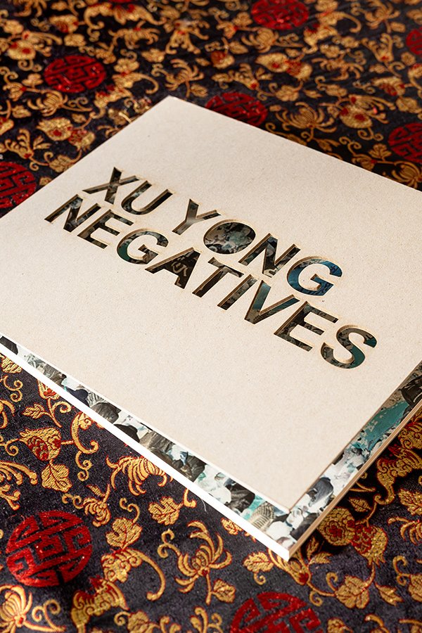
Emaho: Xu Yong’s Negatives (2017) prints the 1989 Tiananmen protest images in reversed colour, so readers use a smartphone to flip them back to positive. Only 350 copies were made, each with a signed print. You’ve also made three books with him. What did it take to publish something this politically explosive, and did you worry about the consequences?
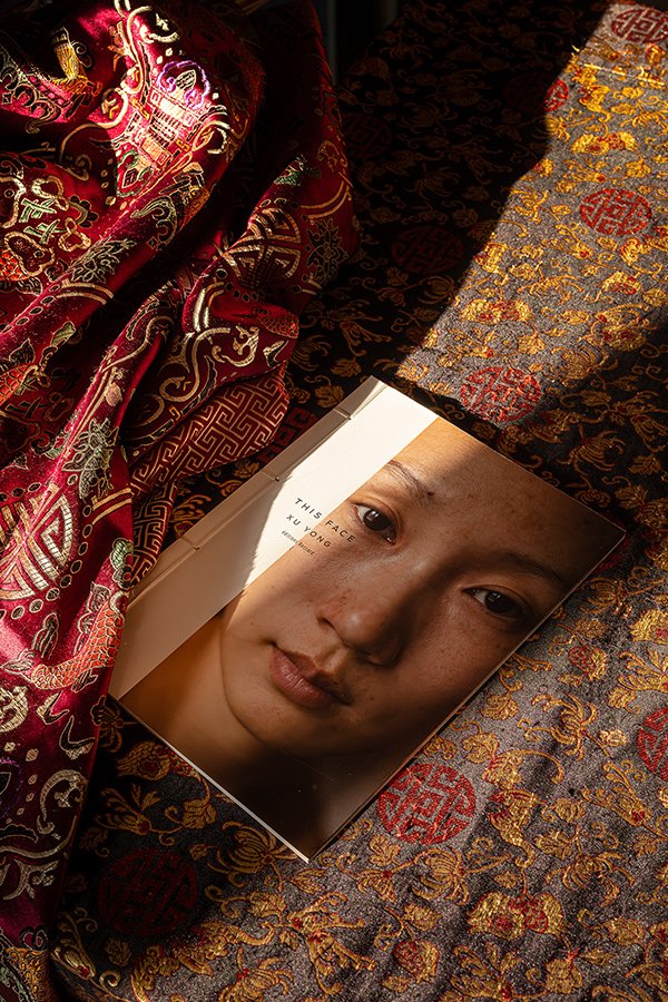
Pierre Bessard: With Negatives, published in 2017, Xu Yong and I addressed a subject that touches one of the great wounds of contemporary Chinese history: the events of Tiananmen Square in June 1989. But before talking about the book, I need to talk about Xu Yong. I have made three books with him, and over the years our relationship has become much more than a professional one. Xu is a lovely man, with whom I have shared many meals, long conversations and many moments in Beijing. His studio is a real museum of his ideas, projects and research. It is a fascinating place, where you immediately understand that his work goes far beyond photography. He has an extraordinary understanding of Chinese society, its codes, networks and relationships. He possesses what the Chinese call guanxi (关系), the network of personal connections, trust and reciprocity that is built over time. With him, I felt at ease. I knew that we could discuss projects freely, think about how to produce them and find solutions to any difficulties we might encounter. Our first collaboration was This Face. There are two versions of this book: a very comprehensive first version, published by Xu Yong himself, containing all the images, and a second version that we designed together at Éditions Bessard. For the latter, I imagined a handmade Chinese binding, in an edition of one hundred numbered and signed copies. It was a much more intimate object, almost a precious one. Xu Yong’s original version was later included in The Chinese Photobook, the reference book by Martin Parr and WassinkLundgren. Our edition was also very successful, selling out in fifteen days. With Negatives, we went much further in exploring the relationship between the book and its reader.
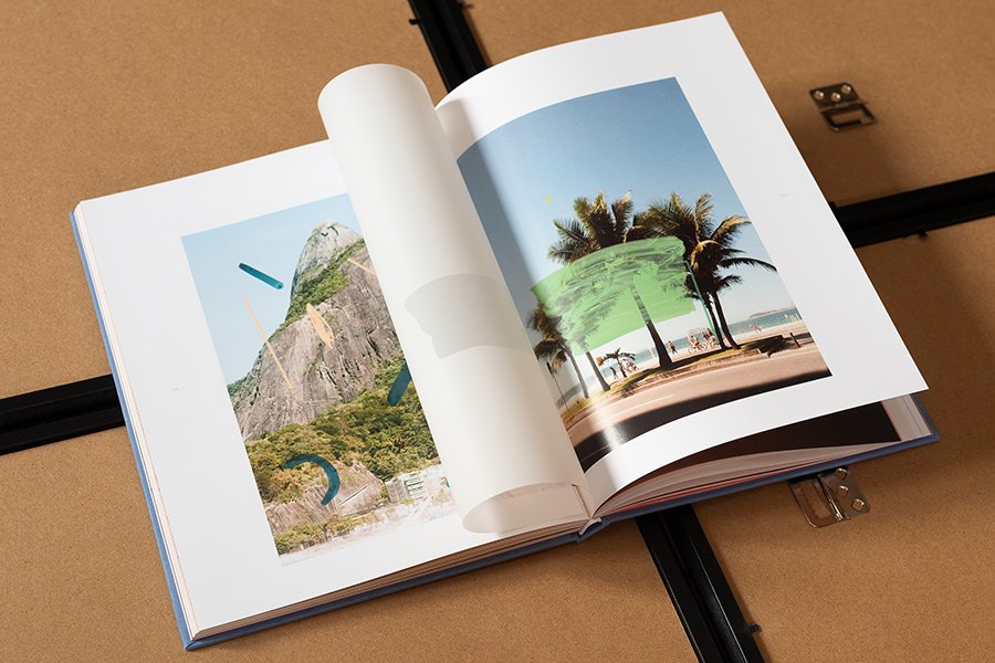
Xu Yong had photographed the demonstrations in Beijing in 1989. These images bear witness to an event whose memory is still very heavily censored in China today. The photographs are printed in inverted colours, like negatives. To see them as positives, readers have to use their smartphones and activate the colour-inversion function. In a way, they become their own photographic printers. I liked this device enormously because it introduced a physical gesture into the act of reading. The reader does not simply receive an image: they have to go and find it. They have to intervene, handle their phone, discover the process and participate in the revelation of the photograph. The book becomes an experience on two levels, analogue and digital. This is something that has interested me for a long time. I like introducing a tactile or interactive dimension into my publications, but only when there is a genuine reason for doing so. I am not interested in interactivity as a passing trend. It must extend the artist’s intention and bring something to the reading experience. I am thinking in particular of Playground, the first book by the young Brazilian artist Alice Quaresma, whose design and art direction were handled by Mariana Jaguaribe. It is a book I like very much. Alice’s work notably involves painting interventions on her own photographs. The tracing paper, transparencies, different papers and the construction of the pages allow the artist’s gestures to be physically recreated in the book. Everything has been thought through remarkably well. The paper is not there simply to embellish the images: it becomes part of their language. This is exactly the kind of thinking that interests me in photobook publishing. To return to Negatives, the political question was obviously present. You have to understand that the events of Tiananmen are practically absent from contemporary Chinese public life. Internet searches are filtered, references are removed and commemorations are prevented. What particularly struck me in my conversations in China was discovering that many young Chinese people simply did not know about this episode in their own history. That is not true of everyone, of course, but this break in the transmission of memory is extremely disturbing.
I therefore felt it was essential to help these photographs circulate. A book can sometimes preserve what other forms of communication seek to make disappear. It can cross borders, pass from hand to hand and continue to exist long after its publication. Was I afraid of the consequences? I am not going to pretend that I never asked myself questions. But I had great confidence in Xu Yong and in his understanding of his own environment. I was not making the decisions alone, and I knew we were moving forward together. There is a little anecdote that is quite revealing. I had arranged for around thirty additional copies to be sent to Xu Yong through the French Embassy and its cultural attaché. Those books never reached him. They disappeared somewhere along the way. I never really found out what had happened to them. I prefer not to draw conclusions about what took place, but the episode is quite telling. What is interesting is that I never experienced this collaboration in an atmosphere of constant confrontation. Xu Yong is a profoundly humane, generous and intelligent person. We worked together with a great deal of trust and even a certain lightness, despite the seriousness of the subject. Ultimately, I believe this is also what a publisher’s work should make possible: creating a space of freedom for an artist, giving them the means to make their work exist and finding the right form through which to transmit it. With Negatives, we published 350 copies, each accompanied by a signed print. I did not necessarily know what the life of this book would be, or how far it might circulate. But I knew why it had to be made. And that is probably what matters most to me: not allowing political, economic or commercial constraints to decide on the artist’s behalf what deserves to be shown.
Emaho: You launched the house on Duane Michals’s birthday, and in February 2021 you published his book The Idiots Delight on that same birthday. You’ve said it cost far more than you charged, and that the airfreight copies vanished in an hour. Did you plan that coincidence, and what’s it like to publish an artist whose work you admired for so long?
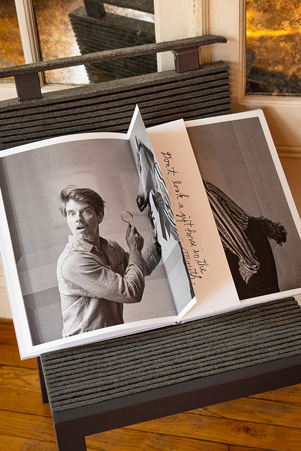
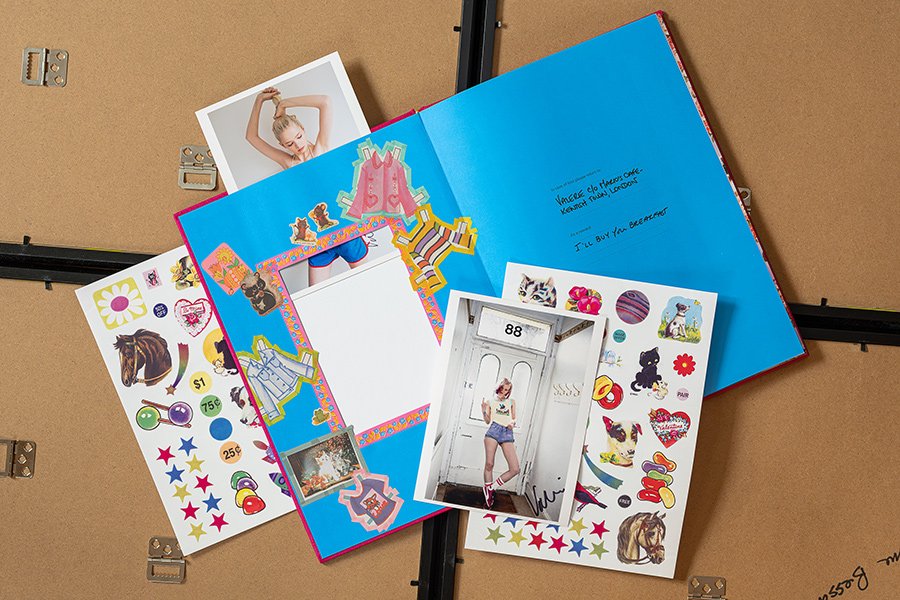
Pierre Bessard: There is a rather amusing coincidence in this story: I was born on February 19, and Duane Michals on February 18. I launched Éditions Bessard on his birthday, and when I published The Idiots Delight in February 2021, I wanted to return to that same date. There was something personal about it, almost a little nod to him. Duane’s work has been with me for a long time; he is an artist I deeply admire. The first time I met him in person was at Paris Photo. A gallery from Milan introduced us. To my great surprise, Duane held out his hand and said, right from the start: “You are very elegant and handsome.” I immediately replied: “Yes!” I loved it. I was completely taken aback by this opening, by his humour and by the very direct, very free way he had of making you feel at ease. I had brought a book from my collection. He picked it up and wrote a dedication by hand. That book is now in my warehouse, among my collection. I have so many books that I am running out of space, but that is also what being a collector is about: you never know when to stop. And obviously, you don’t easily part with a book signed by Duane Michals! For The Idiots Delight, I wanted the book to live up to his universe. Duane has a rather rare ability to make an ordinary situation tip into the absurd, the poetic or the comic. He has worked for a long time at the boundary between photography and writing. His handwritten texts are not simply captions explaining the images: they extend his thinking, give it another voice, sometimes a contradictory one, and open up a space for interpretation.
In The Idiots Delight, he plays with English idioms and proverbs. He takes them almost literally and transforms them into little photographic scenes, often absurd and sometimes downright hilarious. What is remarkable is the way the book organises the act of discovery. The texts, in French and English, are hidden in shorter pages placed at the centre of the images. The reader first discovers the photograph, tries to understand the play on words, and then lifts the page to find the answer. There are also fold-outs and accordion sequences. The book becomes a kind of game, a little visual theatre in which the reader is invited to participate. That is precisely what I love about Duane’s work: he never simply produces a beautiful image. He constructs a situation, a narrative, a shift in perspective. He makes us look differently. And here, the book itself becomes an extension of his humour. Form and content are inseparable.
I was fortunate to work with Sybren Kuyper, whom everyone knows as SYB. He is a great designer, a true genius of the book. Alongside Ramon Pez, I consider him one of the very greatest book designers I have had the privilege of working with. For The Idiots Delight, his graphic intelligence was essential: he understood that he should not simply lay out Duane’s photographs and texts, but invent a reading mechanism that would become an integral part of the work. The book also won the Photo-Text Book Award at Les Rencontres d’Arles in 2021. It was a wonderful recognition for Duane, SYB and Éditions Bessard. The production was also a rather unusual adventure. I usually have my books transported by sea. I plan for the lead times: it takes around forty-five days to get from the printer to my home, but this allows me to anticipate and control costs. With The Idiots Delight, things accelerated much faster than expected. I had started promoting the book, orders came flooding in, and I found myself overwhelmed by the title’s immediate success. I did not want to make readers wait a month and a half. So I decided to have some of the copies shipped by air. But air freight is incredibly expensive: in this particular case, the transport cost almost as much as manufacturing the books themselves. The copies in that shipment sold out in an hour. Of course, the sales covered the transport expense, but they did not generate any additional margin to finance the next book. That is an important distinction: a book’s success does not necessarily mean that it is financially profitable. I have enormous admiration for great book designers. One of them is Irma Boom, whom I consider an absolute queen of editorial design. I was lucky enough to shake her hand at an exhibition at the Dutch Embassy in Paris. Unfortunately, I have never worked with her. It is one of my little regrets. I sometimes buy her books simply because they are by her: that gives you an idea of how much I admire her work. Publishing Duane Michals was therefore about much more than adding a famous name to my catalogue. It meant being able to accompany an artist whose work had nourished my way of seeing for years, and offering him an object that extended his intelligence, humour and freedom. There are books you publish because the project is good; and then there are those you publish because you deeply want to see them exist. The Idiots Delight belongs to both categories.
Emaho: Beyond single books, you’ve built whole series: the Zine Collection, which reached number 27, L’Atelier RisoGraphique, and L’Impériale, with volumes by Claudio Edinger, José Diniz and Rogério Reis. About 40% of the photographers in your Bespoke collection are women, and you took a chance on Kristin Trüb when she was unknown. How do you decide what becomes a zine, a Riso title or a full book, and what does it take to carry an unknown photographer?
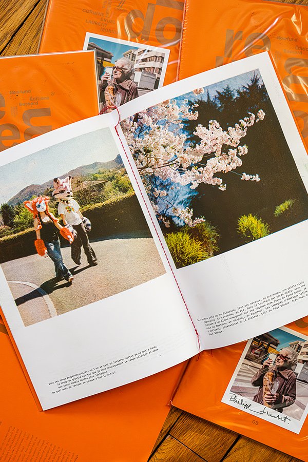
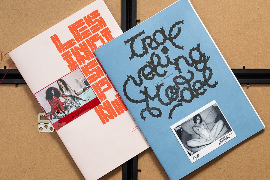
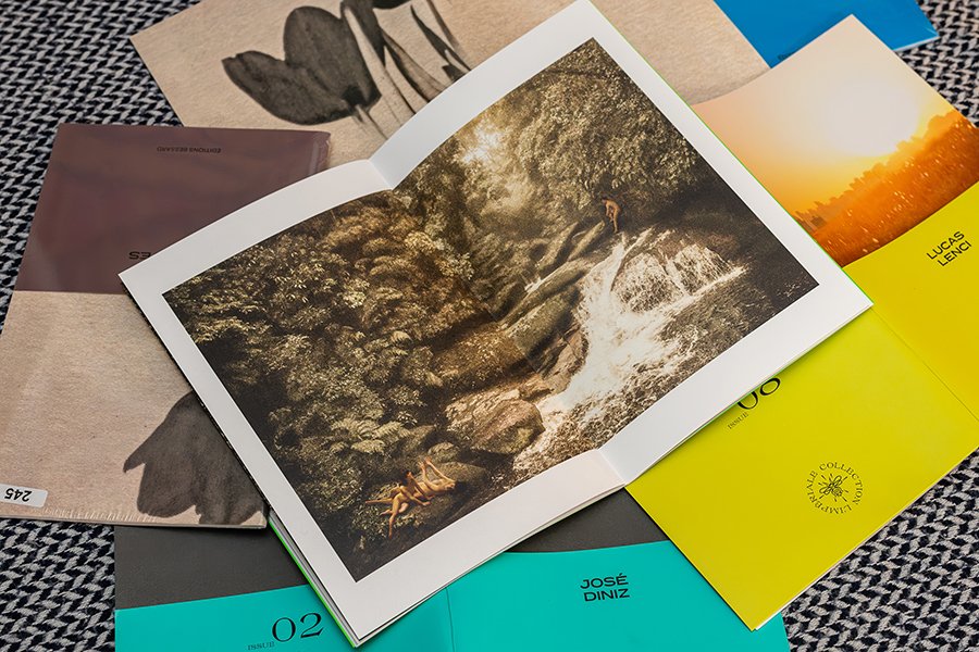
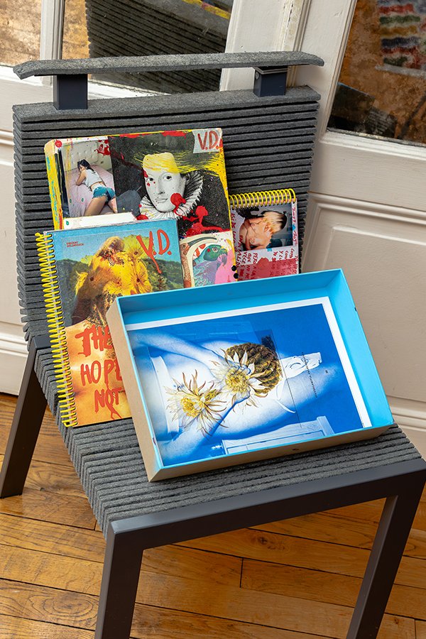
Pierre Bessard: Over the years, I have created several collections, each responding to a particular need. They are not simply categories in a catalogue: they correspond to different moments in my journey, different editorial interests and different ways of supporting photographers. The Zine Collection was born at the beginning of Éditions Bessard. I had just founded the publishing house and needed to find a way to maintain a regular presence in the photobook market. Publishing a book every month was a way of making the publishing house visible and maintaining a relationship with booksellers, collectors and readers. The zine was the most efficient and economical way to produce a book: a lighter format, relatively simple production and limited print runs. The collection eventually reached number 27. It allowed me to take risks, discover artists and gradually build my catalogue. The Bespoke collection came next, as a natural development of the Zine Collection. The books are more elaborate and more expensive to produce, but they remain rare editions. I wanted the cover to be a genuine material experience: it can be tactile, colourful, embossed, textured, sometimes covered in velvet or red felt. I work a great deal with materials, textures and sensations. I want readers to feel like picking up the book even before they open it. The cover is not simply packaging; it is already part of the artistic project. The L’Impériale Collection came from a different desire. After living in China and publishing several Chinese photographers, I wanted to look in an almost opposite direction: Brazil. I had been fascinated by the country, its photographers, its colours, its diversity and its energy. I wanted to build a dialogue with that photographic scene, particularly through Claudio Edinger, José Diniz and Rogério Reis. It was also a way of moving beyond my usual editorial territory. Portuguese is still a difficult language for me! I am learning it now, partly because I spend a great deal of time in Portugal, where I am developing a food-forest and biodiversity project. L’Atelier RisoGraphique follows a different logic. Risography is a printing process I particularly like. In my view, it is one of the most economical and restrained techniques available to me: a master acts as a stencil, and the ink passes through the paper at room temperature, without the plate-making and heat-drying stages found in other printing processes. I use plant-based inks and work with uncoated papers.
The machine imposes its limitations: a restricted number of colours, sometimes unpredictable registration shifts, and overlapping colours that are never exactly identical. But these are precisely the characteristics that interest me. They give the book a presence and a singularity. Each copy has its own small differences. I make these books in Paris, at home, from printing through to binding. I even bought a double-feed sewing machine so that I could sew the signatures myself. The paper manufacturer Fedrigoni supports me by providing me with some magnificent papers. I have thus developed a degree of production autonomy that I did not have before. I can work at my own pace and choose the papers, colours, inks and finishes without depending on an external production chain. This collection also allows me to publish many women photographers. I have never established a quota or built a publishing policy around a percentage. I choose projects for their singularity, strength and necessity. It is true that around 40% of the photographers in the Bespoke collection are women, but I would also invite you to look at the artists published in L’Atelier RisoGraphique: women are very well represented there too. Above all, I would not want this attention to be reduced to a statistic. What interests me is giving space to perspectives that deserve to be discovered. For me, publishing a photographer who is still unknown is one of the most interesting aspects of the job. Kristin Trüb is a good example. When I decided to publish Letzte Generation Ost, she had not yet achieved the international recognition she would later receive. Her project immediately interested me: she revisited the last generation born in the final years of the GDR, through portraits, landscapes, interviews and documents relating to the East German state’s surveillance of their families. It was not simply a documentary project about a place or a period. There was a genuine reflection on memory, identity and the way political history runs through individual lives. I chose to trust her and to build a book worthy of her project. We produced a 150-page book, presented in a box, with photographs on the cover, a print and separate files devoted to the families she had met. It was a demanding production for an artist who did not yet have an established audience.
But that is precisely the role of a publisher: not to wait until a photographer is already recognised before giving them a chance. You have to be able to see what their work might become, and be willing to take the risk alongside them. The book was later noticed, particularly by the Goethe-Institut and in connection with the Kassel Dummy Award. But that subsequent recognition was not what had motivated my decision. There is, however, an economic reality that it would be dishonest not to mention. Since Covid, inflation, the war in Ukraine, tensions in the Middle East and successive crises, selling photobooks has become particularly difficult. The cultural market is under pressure. I experienced a period when I could afford to publish a first book, take substantial risks and produce very expensive objects without knowing exactly how they would be received. That period of almost unlimited freedom may be behind me. I don’t know whether the market has changed, whether I have changed, or whether it is both. My way of life has also changed. Today, I devote much more time to meditation, mountaineering, permaculture and my project in Portugal. I create tree guilds adapted to dry climates and think about biodiversity and resilience to Mediterranean summers. This has inevitably changed my relationship with work and production. I no longer want to spend my days managing huge stocks, organising transport or manufacturing quantities whose eventual destination I cannot always control. Today, with risography, I prefer to produce 250 copies that I can sell directly to readers and collectors I know. I do not reprint. I do not want to build up stocks that will end up in a warehouse, or manufacture books that will eventually be pulped. I could sometimes print more, but I no longer want to. We also have to be honest: assembling, folding and collating the sheets, then sewing the books, takes an enormous amount of time. I prefer to manage a reasonable print run and retain the pleasure of making each book.
It was within this new way of working that The 11 Collection was born, in collaboration with Newfund. The project forced me to move even further beyond my usual world. For fifteen years, my world had been that of photographers, collectors and a handful of specialist bookshops. With The 11, I find myself sitting around a table with an entrepreneur who builds satellites, a photographer who has worked in Yemen or Lagos, and investors who read financial statements every day. Each volume grows out of a conversation between an entrepreneur and a photographer. No one has the authority to impose a title. The word emerges from their exchange, and the photographer then interprets it through their images. I had never before built a book around a word that did not exist when the pair was first brought together. It forces me to listen more, to plan less in advance and to leave room for the unexpected. The art direction of this collection is handled by Thibault Geffroy, an exceptionally talented designer and typographer. He graduated from Penninghen in 2010 and now teaches graphic design and typography there. He had already worked, alongside Clémentine de la Blignières, on the graphic design of Wang Qingsong’s book. I greatly appreciate his intelligence and his ability to understand a project as a whole, beyond its purely graphic appearance. Each volume of The 11 is printed in risography in Paris, in an edition of 250 copies. It is a collection that allows me to bring together worlds that do not usually meet: photography, publishing, entrepreneurship and creativity. And every encounter reveals something to me that I probably would not have gone looking for on my own. Ultimately, I think this is what still motivates me today: being able to continue publishing first books, discovering photographers and experimenting with materials and techniques, but within a more autonomous, lighter and more peaceful way of working. I have not lost my desire to take risks. I have simply changed the way I take them.
Emaho: You work alone, with no office or distributor, selling directly to about 5,000 collectors you know by name, and your main books cost 75 euros. You don’t ask photographers or institutions for money, and you don’t enter competitions. In your words, “I leave medals to the military.” Why do you think so many photobook publishers are struggling?
Pierre Bessard: I think many photobook publishers are facing a structural problem: production costs are very high, print runs remain small, and the market has not grown at the same pace as the number of publications. The traditional distribution and sales system absorbs a significant share of the book’s retail price, while sales through bookshops are often no longer sufficient to recoup the investment.
I have chosen a different model. I work alone, without an office or distributor, and sell directly to a community of more than 5,000 collectors, many of whom I know personally. This network grows every day. I do not ask photographers to finance their books, I do not solicit institutions, and I do not chase prizes or medals. As I often say: “I leave medals to the military.”
I prefer to devote my energy to books, artists and readers. It is a demanding model, based on direct relationships and trust built over many years. But it allows me to remain free in my editorial choices. And that freedom is probably what I am trying to preserve above all else.
Emaho: After nineteen trips to Pyongyang since 1991, you made Soleil généreux, collages mixing comic panels, propaganda posters, stamps and pins with your own photographs. You get several publishing requests a week, and very few of your books are your own work. How do you balance being a publisher and an artist, and what are the “classics of tomorrow” you still want to make?
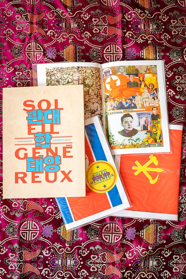
Pierre Bessard: Before making Soleil généreux, I had already devoted part of my work to North Korea through documentary filmmaking. I made two films for CAPA, broadcast on ARTE one year apart: North Korea: Behind the Scenes, followed by North Korea: The Nuclear Blackmail. These films shaped my view of the country and my thinking about how to tell the story of such a closed society. I have made nineteen trips to Pyongyang since 1991. Those visits gave rise to Soleil généreux, a collage project combining my photographs with comic-book panels, propaganda posters, stamps and North Korean pins. The title refers to the sun celebrated in the country’s patriotic anthem. In North Korea, images are everywhere, but they are entirely codified and staged. Rather than seeking to make a direct denunciation, I chose to work with the materiality of the images produced by the regime: cutting them up, moving them around and confronting them with my own photographs in order to bring out their contradictions.
Héloïse Conésa, Chief Curator of Heritage at the Bibliothèque Nationale de France, wrote a very beautiful text about this work. She compares my collages to the photomontages of Hannah Höch, John Heartfield and Raoul Hausmann, but also to the Pop Art of Richard Hamilton and Andy Warhol. She particularly understood the irony of this approach: using the visual codes of American culture, North Korea’s historical enemy, to reveal the mechanisms of its propaganda. She describes my photographs as “grains of sand” introduced into the regime’s visual machinery. It is an interpretation that means a great deal to me. The book was published by Éditions de Juillet, not Éditions Bessard. I do not systematically seek to publish my own work through my publishing house. Being a publisher and being a photographer are two complementary but different activities. As a publisher, I put myself at the service of someone else’s vision. As a photographer, I develop my own obsessions and make my own decisions.
People often ask me which classics of tomorrow I still want to publish. I do not believe that you can identify them in advance. A book sometimes finds its true place years after publication. What I want is to continue discovering photographers, publishing first books and making objects in which images, paper, typography and binding form a whole. When I founded Éditions Bessard, I wanted to publish the classics of tomorrow. I still believe in that ambition. But I am not trying to manufacture monuments: I simply want to publish books in which I deeply believe, and give them every chance of lasting.
Photos © Pierre Bessard