England:
Emaho caught up with the eccentric British artist Penny to find out why he’s so obsessed with money…
Emaho : Tell us how you first got interested in art…
I’ve been into making images and thinking of ideas ever since I can remember. I don’t think there was a specific time I got interested in art as such, I have just always had a natural interest in being creative and translating my ideas through a visual medium. In the early part of my adult life I was a graphic designer, which isn’t that far removed from what I’m doing today, so I guess I’ve always been an artist in one shape or form.
Emaho : Stencilling seems to be your stylistic device, what made you choose to take it up?
The first stencil I cut was in 2001 when I was at Central Saint Martins doing a graphic design degree. I was so poor at the time that whenever we got a project I would always try to work out the cheapest possible way to do it… most of the time that meant making my course work out of paper, masking tape and found items. That was usually nothing more exciting than cardboard boxes, scrap wood or defunct machinery that I found in skips. I was like an East London Womble trying to recycle rubbish in creative ways, it was a bit ridiculous! A break though moment happened when I found a few cans of car paint in a cupboard under the stairs in my flat and thought to myself, “That’s gonna save money on printing costs!” I started to use stencilling for almost every single project after that. I started off by cutting text for large format posters until I eventually cut much smaller type and from there went on to cut stencils for pictures. It was very limited at the time and I learnt as I went along, making mistakes and correcting them, thinking up new techniques for specific problems. That was the fun and the beauty of it — I loved the limitations, the limitations gave me a kind of freedom. I know that sounds like an oxymoron but having to find a solution to a visual brief with a limited palette of materials was very exciting. Each project brought new challenges and I tried to find a way to push myself with each stencil by making it more complicated or more detailed, or much smaller, I was always trying to improve from the last stencil. It has taken me on a journey that I’m still on today.
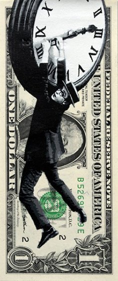
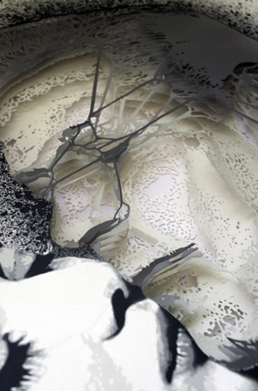
 Time is Money
Emaho : Would you care to elaborate on the process? And how long does it take you to complete one work?
Okay, but prepare to be bored! Over the years I have developed a few different techniques that are suitable for different outcomes. They mainly consist of two main disciplines, multi-layer and halftone. There are sub-category techniques within both of those but those two will do for now. Initially I found that I could get the most detail into an image by using the multi-layer technique. That process starts with creating an image; it might be something that I’m going to be cutting out for a few months, so I make sure that it’s an image that I’m happy to spend that sort of time on. It kind of works as a self editing process too, you don’t want to spend every waking hour on an image you think is only okay, you’ll never finish it, so you make sure you love the image before you start cutting. I separate my image into different tonal gradients and/or colours to be cut out separately. The whole time you’re doing this you’ve got to add in bridges. That’s what makes a stencil a stencil, the bridges hold the floating islands of negative space together and give a stencilled image its distinctive style. Once they are all cut, you spray paint each stencil layer by layer maintaining perfect registration to create the image. It’s like a very laborious version of screen printing.
I found that multi-layer stencils weren’t appropriate for all types of projects and had to figure out a new method. I wanted to paint my super complicated and detailed images in the street (without permission/the fun way) and painting ten layers on to a wall was going to take too much time. On my travels aroundLondonI saw a garage that had been broken into, the door was really buckled and dented and I thought it would fit really well with an image of a man being punched in the face. I took a photo of the garage door, measured it up and went back to the studio to create the image and figure out a way of painting it exactly as I imaged it to be. This is how I got into cutting halftone stencils. Halftone images are how photos in newspapers used to be printed; they are made up of black dots, or lines, that are either large in darker areas of an image or very small in light areas. I knew it would mean spending hundreds of hours cutting out all of the tiny holes, but on the plus side I would be able to paint it very quickly. I printed out the halftone image in A3 sections and taped them all together. It took about seven weeks to cut and five minutes to paint. The plan worked and I was hooked! I have since tried to push the detail as far as I can go and I’m still surprising myself with how much more detail I can get from tiny cutting holes in paper.

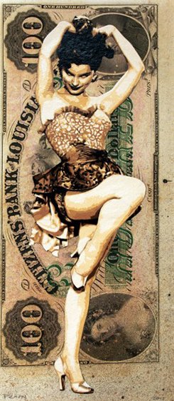
Maia in Spring
Emaho : Money seems to be a driving force behind your artwork…
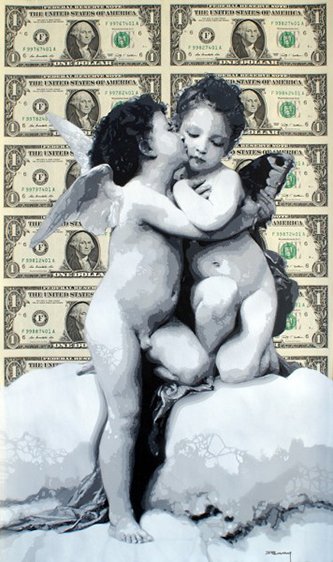
Painting on money, for me, has a parallel with painting in the street — in the minds of some it’s destroying something, ruining a perfectly decent surface, bringing down the tone of an area. For others it’s about transforming something redundant into something beautiful, or at the very least intriguing, something to start a conversation, make people stop and think for a second. I think it’s that feeling of taboo, that it isn’t legal. They both have that in common. In the same way that the garage door was utilised as a background to give context to an image, it also inspired the image in the first place. People have a constant love/hate relationship with money; it signifies so many things about nations and their past that it’s such a rich source of inspiration for me. It’s like having walls throughout history at your fingertips, ready and waiting to be sprayed.
 Eek Out
Emaho : Is there any particular reason why it’s the U.S. one dollar bill particularly, behind every work?
Well I do use other currencies too, but my work with the dollar bill is more prolific. The dollar is the archetypal currency. As soon as you think of money, you think of the dollar. It’s the global currency and it’s loaded with meaning:America, global power, capitalism. On top of all that, dollars actually look really cool. There’s almost a gothic, mythical feel to a dollar bill. When we look at the dollar or money in general in a modern context, it can take on a rather sinister quality… a bit like the bats, beasts and demons from Falero’s “Departure of the Witches”. Money is the pair of beady eyes that stares out at all of us every day of our lives. Still, unblinking faces staring out at you from a banknote. I liked the idea of these faces looking over the characters or scenes I’d paint, like an omnipresent voyeur watching over its subjects. It creates a really interesting tension and allows me to develop a narrative in my work.
 Cloud One
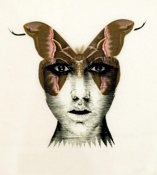
Emaho : What else motivates your work besides the notion of money?
I like to paint images on substrates that provide an interesting context for my images and I have really enjoyed using taxidermy butterflies in my work — they are so beautiful, so perfectly symmetrical and delicate, but they have a haunting quality too because they are dead. You may have heard of the expression ‘dead behind the eyes’ and that gave me the idea of actually putting something ‘dead’ behind the ‘eyes’… something dead and beautiful. They have evolutionary traits that are paramount for their survival: They are bright, colourful and have distinctive markings to attract mates and also use the same elements to ward off predators or use as camouflage. They are such an amazing example of being a product of their environment, such visually engaging creatures.
 Bela Dena
Emaho : You say the Renaissance depiction of beauty has been a recurrent theme. What is your take on the idea of beauty in today’s world?
I find the shifting paradigms of beauty though the ages very interesting. The fact that our perception of attractiveness is malleable and alters over time seems to show that we are susceptible to suggestion from outside influences. Certain looks and body shapes, subconsciously or otherwise, hold with them certain connotations which differ among groups and cultures, and it’s these ideas that I am interested in exploring.
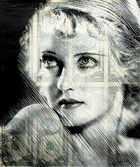
 Bette D
Emaho : What was the motive behind your use of Frankenstein’s image on top of the two penny piece in your Economy of Scale exhibition?
The painted two pence pieces in the penny pusher coin machine were just a bit of fun, not in any way “serious” pieces of art. I wanted an element of fun and interaction at the show and a way for anyone to be able to take home a little souvenir of the exhibition. Those penny machines really reminded me of my youth, I preferred to play on them rather than the games they had at the arcade. It was a bit weird at the exhibition, big grown men scrapping over the machine, vying for opportunity to try and win little spray painted coins with tiny images on them, maybe it was the playful nature of the machine, and I suppose it doesn’t do any harm to regress at times! I have been painting on coins from when I first started painting stencils. I would use them as weights to hold down edges of paper and they would get covered in paint and looked like an inviting surface to paint an image on. I used to send them to people that had bought work from me as a fun little extra.

Medusa
Emaho : You had said in an interview that Chuck Close has been a great inspiration to you. What work of his inspired you so much?
I’ve always been a big admirer of Chuck Close; I was blown away by his precision, detail and the laborious nature of his work when I first saw it as a teenager. It was great for me to see someone that used as rigid a process as he does and for the finished pieces to still have such feeling and depth. There is a great quote of his that has always stuck with me, he said, “Inspiration is for amateurs. The rest of us just show up and get to work. If you wait around for the clouds to part and a bolt of lightening to strike you in the brain, you are not going to make an awful lot of work. All the best ideas come out of the process; they come out of the work itself.” The work is my motivation too, I’m obsessed with the challenge of working around problems, producing complicated and delicate images from cumbersome and basic tools and enjoying the doing rather than obsessing with being the finished article.
 Never Together For Long
Emaho : Any new projects that you are working on lately?
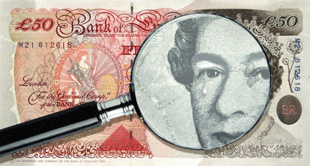
I’m working on a few new pieces for a show at Rook & Raven gallery, opening on 26th February. They have invited The Rolling Stones’ Bill Wyman to exhibit his photography alongside selected artists that have re-appropriated his images into their individual styles. It’s part of their 50th anniversary celebration, so I am appropriately obliging to the theme and painting on some £50 notes. I tend to cut multiple projects at the same time and then paint in batches, my progress can be followed on my Facebook page which I use as a blog to document my process and upcoming work on Facebook

Tears in the Reign
Art & Culture Interviewed by Sandhya Das
Artwork by Penny